
If staff walk past your cybersecurity posters without acting on them, focus each reminder on one decision they face at work. A specific action, placed where that decision happens, is easier to use than a page of general warnings.
Why cybersecurity awareness posters fail before the message does
A poster fails for reasons that have nothing to do with the words on it. It goes up once, in the kitchen, at eye level for nobody, and stays there for three years until it is yellowed and irrelevant. Staff stop seeing it the way you stop seeing your own hallway. The content is rarely the problem. The deployment is.
The organisations that get value from awareness posters treat them as a rotating asset, not a one-off decoration exercise. They change the location, refresh the message every few months, and put the same core ideas in more than one channel — a poster near the printer, the same tip in the all-staff newsletter, a slightly different version on the intranet login page. Repetition across channels is what moves a message from "seen" to "remembered."
What makes a staff-facing tip actually land
A good staff tip is short enough to read in the time it takes to walk past it, specific enough to act on, and framed around a behaviour rather than a threat category. "Beware of phishing" tells a staff member nothing they can do differently tomorrow morning. "Hover over the sender's email address before you click a link — if it doesn't match the name you know, don't click it" gives them a concrete action.
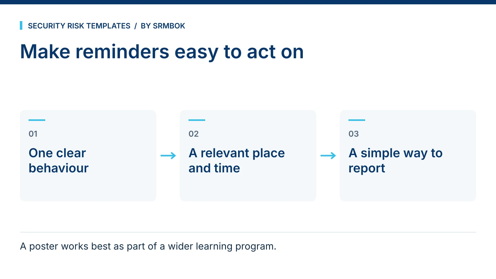
The tips that stick tend to share three properties:
- One idea per poster. Combine three warnings on one page and staff remember none of them.
- A verb, not a category. "Verify before you pay" beats "invoice fraud awareness."
- A reason to comply, not just an instruction. People follow rules they understand better than rules they are simply told to follow.
This is the same discipline used in incident and hazard analysis more broadly — a bow-tie diagram works for the same reason a good poster does, because it forces you to name the specific preventive action rather than a vague category of risk. If you have not used bow-tie analysis before, Bow-Tie Analysis Explained in 15 Minutes covers the method in the time it takes to read one page.
Placement matters more than design
Where a poster sits changes what it does. A tip about verifying payment requests belongs near the desk where invoices are actually approved, not in a corridor nobody uses to walk to that desk. A tip about tailgating belongs at the door it applies to, not on a general noticeboard three rooms away. This is the same logic behind a point-of-decision prompt in safety signage — a reminder works best in the seconds before the behaviour it is trying to change, not somewhere convenient to print it.
This also means one poster design rarely suits every location. A version for a shared kitchen can carry more text because people linger there. A version for a doorway needs to be readable in the two seconds someone takes to walk through it: a short phrase and one visual cue, nothing more. If your provided material is a single flat design, consider whether it needs to be resized or trimmed for the locations where the message matters most, rather than printed once at one size and distributed evenly.
Worked example: a rotation plan for a three-site logistics firm
Take a fictional three-site logistics firm, Merrivale Freight, with a warehouse crew, a small office team and a mobile sales fleet. A security-conscious operations manager wants awareness material up within a fortnight but cannot run training sessions across three sites on short notice.
A simple rotation plan for the first quarter might look like this:
| Month | Poster location | Tip theme | Reinforcement channel |
|---|---|---|---|
| 1 | Warehouse muster point, office kitchen | Verifying links before clicking | All-staff email with the same tip |
| 2 | Loading dock noticeboard, office entry | Reporting suspicious contact without fear of blame | Toolbox talk agenda item |
| 3 | Driver rest areas, office kitchen | Protecting login credentials on shared devices | Intranet banner |
Nothing here requires a big budget. It requires a plan for where the posters go, how often they change, and what reinforces them elsewhere. The theme in month two — reporting without fear of blame — matters more than it looks. Staff who think reporting a mistake will get them in trouble simply stop reporting, which is the same dynamic covered in Assessing Danger Without First Deciding Who Is at Fault: you find out about problems faster when people are not afraid to raise them.
Branding without diluting the message
A poster with your logo in the corner and your brand colours behind the text will get more genuine attention than a generic stock template, because staff recognise it as belonging to their own organisation rather than to a vendor selling something. Keep the branding to colour, logo placement and typography. Do not let a design team rewrite the tip itself to sound more "on brand" — a watered-down instruction ("Please be cyber safe") is worse than no poster at all, because it teaches staff that the posters are decoration rather than instruction.
This is also a cheap way to make a security message look like it belongs to the organisation rather than to an outside vendor, which matters more than most security teams assume. Staff are quicker to dismiss anything that reads as a stock compliance product than something that looks like it was produced in-house, even when the underlying content is identical.
Common mistakes
- Putting posters up once and never rotating them. A tip that has been on the wall for two years is wallpaper, not awareness. If you cannot remember the last time you changed it, neither can your staff, which is exactly the problem.
- Combining multiple warnings on a single poster. One idea, one action, one poster. A crowded poster asks a passer-by to do the prioritising you should have done for them.
- Using threat-category language instead of a behaviour. "Phishing awareness" instructs nobody. "Check the sender before you click" does. If a tip could be answered with "yes, I'm aware," it has not told anyone what to do.
- Blame-flavoured reporting messages. If the subtext is "don't be the one who clicks the link," people will hide mistakes rather than report them, and you lose the early warning that a fast report gives you.
- Ignoring placement. A well-written tip in the wrong location does the work of a badly written one. Match the message to the point where the behaviour actually happens.
- Treating the poster as the whole programme. A poster reinforces a message; it does not build one from nothing. It works best alongside other free material, not as a substitute for it.
Get your posters
You do not need a design brief or a subscription to produce these. The Core Four Cybersecurity Awareness Tips gives you ready-to-deploy awareness material with concise, actionable staff tips, customisable with your own branding, for digital displays, email campaigns and printed notices. For a fuller picture of what else is available at no cost, see What You Get Free in the SRMBOK Library. It is free.