
If people join your assessment project without knowing its current stage or next decision, make the process visible. A shared wall chart can support briefings and handovers when it reflects how the team actually works.
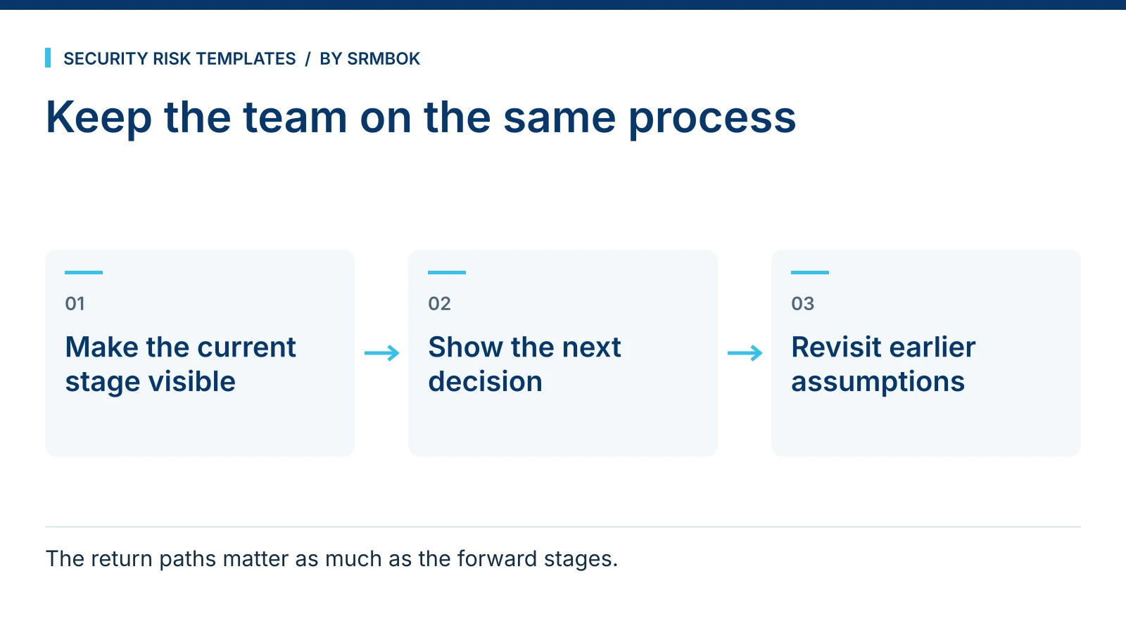
Why a security risk management wall chart earns its space
A risk management life cycle is not complicated once you know it, but it has enough stages, gates and feedback loops that holding the whole thing in your head while also running a live assessment is a genuine cognitive load. A wall chart takes that load off the team. Anyone who walks into the room — a new team member, a stakeholder sitting in on a workshop, an auditor checking process — can see where the work sits without interrupting whoever is running it.
This matters more in security risk work than in a simple linear project, because the process is not linear. Risk assessment loops back to context-setting when new information emerges. Treatment planning loops back to assessment when a proposed control turns out to be infeasible. A chart that only shows a straight line from start to finish misrepresents how the work actually happens, and a team relying on it will be confused the first time they need to go backwards.
What a proper life cycle reference actually needs to show
A useful process chart for a project room does three things a slide deck buried in a shared drive cannot: it stays visible without being opened, it shows the whole cycle at a glance, and it can be pointed at during a disagreement about what happens next. To do that well, a single chart usually is not enough — different moments call for different levels of detail.
Early in a project, the team needs the full detail: every stage, who is typically involved, and where the lanes of activity (governance, assessment, treatment, monitoring) intersect. Day to day, most people just need a quick answer to "what stage are we at and who's leading it" without reading a dense diagram. And when a decision needs sign-off, the team needs to see the actual gate structure — what has to be approved before the work can move forward, and where it goes if it is knocked back.
Worked example: using a three-part chart set in a live project room
Take a fictional critical-infrastructure operator running a security risk assessment across two sites ahead of a system upgrade. The project room has three references on the wall for the length of the engagement:
| Reference | What it's for | Who uses it most |
|---|---|---|
| Detailed life cycle chart | Full stage-by-stage view across governance, assessment, treatment and monitoring lanes | Project lead, when planning the next phase or briefing a new team member |
| Spine chart | A quick, low-detail view for locating the current stage and who is leading it | Everyone walking past — a five-second answer, not a five-minute one |
| Closed-loop process sheet | Shows the gates the work has to pass through and where it returns to if a gate isn't cleared | Governance meetings and sign-off discussions |
In week three of the engagement, a proposed control at Site B fails a feasibility check at what the closed-loop sheet marks as a gate. Rather than the team improvising what happens next, the chart on the wall shows the return path: back to treatment option analysis, not back to square one. That single answer, visible without a meeting, saves a genuine amount of confusion in a live project.
Why the return paths matter more than the forward stages
Most process diagrams are generous with forward arrows and stingy with backward ones, because forward progress is what people want to show stakeholders. But a security risk management process spends a meaningful amount of its life going backwards — new information changes the risk picture, a proposed treatment doesn't survive a cost-benefit review, a governance body sends something back for more work. A chart that only shows the happy path leaves the team guessing exactly at the moment they need clarity most: when something has not gone to plan.
This is also where the chart earns its keep with people who are not close to the day-to-day work. A governance committee that can see the return paths on a wall chart understands that a "sent back" item is a normal part of a working process, not a failure of the project. That framing matters when the same committee is deciding whether to escalate concern about a delay.
Physical placement in the room
A chart only does its job if it is where people naturally look. Pin the detailed chart near the project lead's working area, where it gets consulted during planning, not near the door where it becomes background noise. Put the spine chart where people entering the room see it first — beside the door or above the sign-in sheet — so the five-second question gets answered before anyone sits down. The closed-loop sheet belongs near wherever governance discussions actually happen in that room, whether that is a meeting table or a section of wall reserved for sign-off items.
None of this is complicated, but it is routinely skipped. Teams print good material and then pin it up wherever there happens to be a free patch of wall, which is a different thing from pinning it up where the specific reference gets used. A ten-minute conversation about placement when the project room is set up pays for itself the first time someone needs an answer fast.
Common mistakes
- One chart trying to do three jobs. A chart detailed enough to plan against is too dense to read at a glance, and a chart simple enough to glance at is not detailed enough to plan against. Use different references for different moments, not one chart stretched to cover all of them.
- No return paths shown. If the chart implies the process only moves forward, the team will not know what to do when it doesn't.
- Putting it up once, at kickoff, and never referring back to it. A chart that is decoration by week two was never actually being used to align the team.
- Sizing it for a screen, not a wall. A chart designed as a slide, printed at A4 and pinned up, is unreadable from more than a metre away. Detail-heavy references need to be printed at a size someone can actually read while standing in the room.
- Treating the chart as a substitute for the register and treatment schedule. The chart shows where you are in the process. It does not replace tracking individual risks or treatments — see Risk Register Fields: The Minimum Set That Actually Works and Risk Treatment Schedule Template (Free) for the documents that do that job.
Get the wall charts
The SRMBOK Security Risk Management Life Cycle Wall Charts give you three printable references built for exactly this: a five-lane, 16-stage A3 detailed chart for planning, an A4 spine chart for a quick read on where the work stands and who is leading it, and an A3 closed-loop process sheet showing the 12 gates and six return paths that a straight-line diagram leaves out. If your project room also needs a shared language for handling sensitive material discussed during the assessment, Traffic Light Protocol Explained: TLP:RED to TLP:CLEAR is worth putting up alongside it. The wall charts are free.