
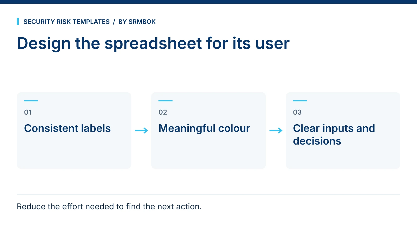
If colleagues cannot tell which cells to edit or which tab is current, fix the spreadsheet's interface before adding more instructions. Consistent cell styles, protected calculations and a clear tab structure make a risk register easier to use correctly.
Risk spreadsheet confusing? It's the interface, not the risk content
A risk register is a working tool that other people — an auditor, a new team member, a colleague covering while you're on leave — need to be able to open and use correctly without you standing over their shoulder. If the spreadsheet doesn't visually distinguish "type your answer here" from "this cell calculates itself, leave it alone," people will type into the wrong cells, and eventually a formula gets overwritten and nobody notices until the totals stop adding up.
This is a solved problem in software design — inputs, calculated fields and static labels look different from each other so users don't have to guess. Risk spreadsheets almost never apply the same discipline, because they get built under deadline pressure by someone focused on the risk content, not the interface. The content is usually sound. The person who built it knows exactly which cells to touch and which to leave alone, because they built it. Everyone else is guessing, and guessing wrong in a spreadsheet is how residual risk ratings quietly go missing.
This matters more in a risk register than in most other spreadsheets, because the cost of a broken formula isn't a cosmetic error — it's a wrong risk rating that a committee makes a decision based on, possibly months before anyone notices the totals don't reconcile.
Colour should mean the same thing every time
The fix is a small, fixed set of conventions applied consistently across every tab, every register, every year. A workable starting convention:
- Yellow cells are always an input. If it's yellow, you're expected to type or select something.
- Light blue cells are always a calculation. A formula lives here. Never type over it.
- Navy cells are always a heading. Structural, not data.
- White cells are never something you fill in. White means "not applicable here" or "static text," not "empty, please complete."
Use text labels and protection as well as colour, so the workbook remains usable for people who cannot distinguish the colours. The specific colours matter less than applying the mapping consistently. The moment a yellow cell somewhere on tab four is secretly a formula, the whole convention stops being trustworthy, and users go back to guessing — which defeats the purpose of colour-coding in the first place.
Before and after: the same register, two ways
Before. A risk register where the likelihood and consequence columns are unformatted white cells, the calculated risk rating column is also white, and a reviewer can't tell by looking whether the rating in row 12 is a manual override or a formula result. A new analyst "corrects" what looks like a wrong number by typing over it, breaking the formula for that row permanently.
After. Likelihood and consequence input cells are yellow. The risk rating column is light blue, protected, and calculated from the two inputs using an agreed formula. Section headings are navy. Anyone opening the register for the first time can tell, without asking, exactly which four cells per row they're responsible for filling in.
The content of the register hasn't changed. The number of support questions from people using it drops sharply, because the spreadsheet is now telling them how to use it instead of relying on them to already know.
It's not just colour
Colour coding solves the input-versus-calculation problem, but a register that confuses people usually has other issues stacked on top of it:
- Tab order that doesn't match how people read. Summary and instructions should come before the detailed working tabs, not after them.
- No legend. If the colour convention isn't documented somewhere in the file itself, it only survives as long as the person who set it up is still around to explain it.
- Inconsistent formatting between tabs. The same field styled differently on tab two versus tab five reads as two different fields, even when it isn't.
- No pre-release check. A register goes out with a broken formula, a stray yellow cell that should be light blue, or a heading styled as a normal cell, because nobody ran a final pass before distributing it.
A style guide exists precisely to make these decisions once, in writing, so they don't get re-litigated — or silently violated — every time someone builds a new tab.
Converting an existing register
Retrofitting conventions onto a register that's already in use is safer done as a discrete exercise rather than a running edit while people are still working in it:
- Freeze a copy of the current version before changing anything, so there's a fallback if a formula breaks during the rework.
- Identify every input cell across every tab and apply the input colour consistently.
- Identify every calculated cell, apply the calculation colour, and protect the cell so it can't be typed over.
- Apply the heading colour to structural cells only — never to a cell that could plausibly hold data.
- Add a legend tab, or a legend at the top of each working tab, so the convention travels with the file rather than living in someone's head.
- Run a formula audit across the whole workbook before redistributing it, checking that nothing was accidentally overwritten during the rework itself.
This is a few hours of unglamorous work. It's also the difference between a register that a new starter can use correctly on day one and one that generates a support question every time someone new opens it.
Common mistakes
- Changing the convention partway through a workbook. Yellow means input on tab one and something else on tab three.
- Leaving calculated cells unprotected. Nothing stops a well-meaning user from typing a number straight over a formula.
- Treating colour as decoration. Colours chosen for how they look rather than what they consistently mean defeat the purpose entirely.
- No documented legend inside the file. The convention lives in the original author's head and leaves with them.
- Skipping a pre-release checklist. Every register that goes out gets a final visual and formula check before anyone else opens it.
Fix the register, not just the risk content
A confusing spreadsheet is often a symptom of a broader issue: risk decisions being recorded without a consistent structure behind them. Assessing Danger Without First Deciding Who Is at Fault covers a related discipline problem — getting the analysis right before the paperwork locks it in. If your register tracks supplier risk specifically, Foreign Ownership, Control or Influence: Screening Suppliers for FOCI is worth pairing with your spreadsheet layout so the fields actually match what you're screening for. And the policy that sits above the register benefits from the same clarity — see Security Risk Management Policy Template (Free, One Page).
The SRMBOK Spreadsheet Style Guide sets out these conventions properly: eight cell styles with hex codes, a standard tab ordering, and a pre-release checklist to run before any register goes out the door. Download the free spreadsheet style guide and apply it to the next register you build, rather than the one after that.